Free library · Checkout Page · Guideline 520
Clear Checkout Steps for Better Usability
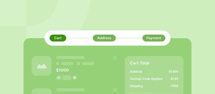
When customers can easily see where they are in the checkout process with honest, easy-to-understand steps and clear labels, fewer people leave without buying. Using simple progress bars and clearly named stages helps shoppers feel more sure about their purchase and more likely to finish buying what's in their cart.
Why It Matters
Why It Matters
- User Confidence: Showing each stage reduces uncertainty and hesitation.
- Higher Completion Rates: Transparent progress indicators help customers see how close they are to finishing, encouraging them to complete the purchase.
- Improved User Experience: A well-defined flow feels intuitive, keeps customers engaged, and increases trust.
Common Problems to Avoid
Common Pitfalls
- Missing Process Indicators: Users get lost when they can’t see how many steps remain.
- Misleading Steps: Grouping multiple actions into a single step leads to confusion about what’s required.
- Vague Labels: Labels like “Step 1” or “Next” fail to set clear expectations.
How to Improve
How to Make It Better
1. Show All Steps: Display every stage from the cart to confirmation. Keep the progress indicator visible so users always know where they are.
2. Use Clear, Descriptive Labels: Name each step in a way that explains what happens next (e.g., “Enter Shipping Info,” “Review Order”).
3. Maintain Step Accuracy: Don’t combine distinct actions into a single step. Ensure your visual indicators match what the user actually experiences, and if possible, provide realistic estimates of how many fields or how much time each step requires.
Key Takeaway
Key Takeaway
A transparent checkout flow with clear, accurate steps and meaningful labels reduces cart abandonment and builds user trust. By focusing on straightforward progress indicators and well-labeled stages, your customers will feel more confident and are more likely to complete their purchases.